The strategy behind the YouForce app
The Challenge: How to steer away from outdated, desktop-bound HR systems into something new that would make the company still relevant for its customer base? This article explores the process that lead us to towards seamless, mobile-first experience that empowers employees to manage essential tasks anytime, anywhere.
Client
Visma Raet
Scope
Strategy
Design Sprint
UX Research
UX Design
Context
001
Why the need for a YouForce app
In an increasingly mobile world, employees expect their HR tasks to be as seamless as ordering a coffee or checking the weather. Yet for many organizations, HR systems remain trapped in outdated, desktop-first workflows that are slow, fragmented, and difficult to navigate.
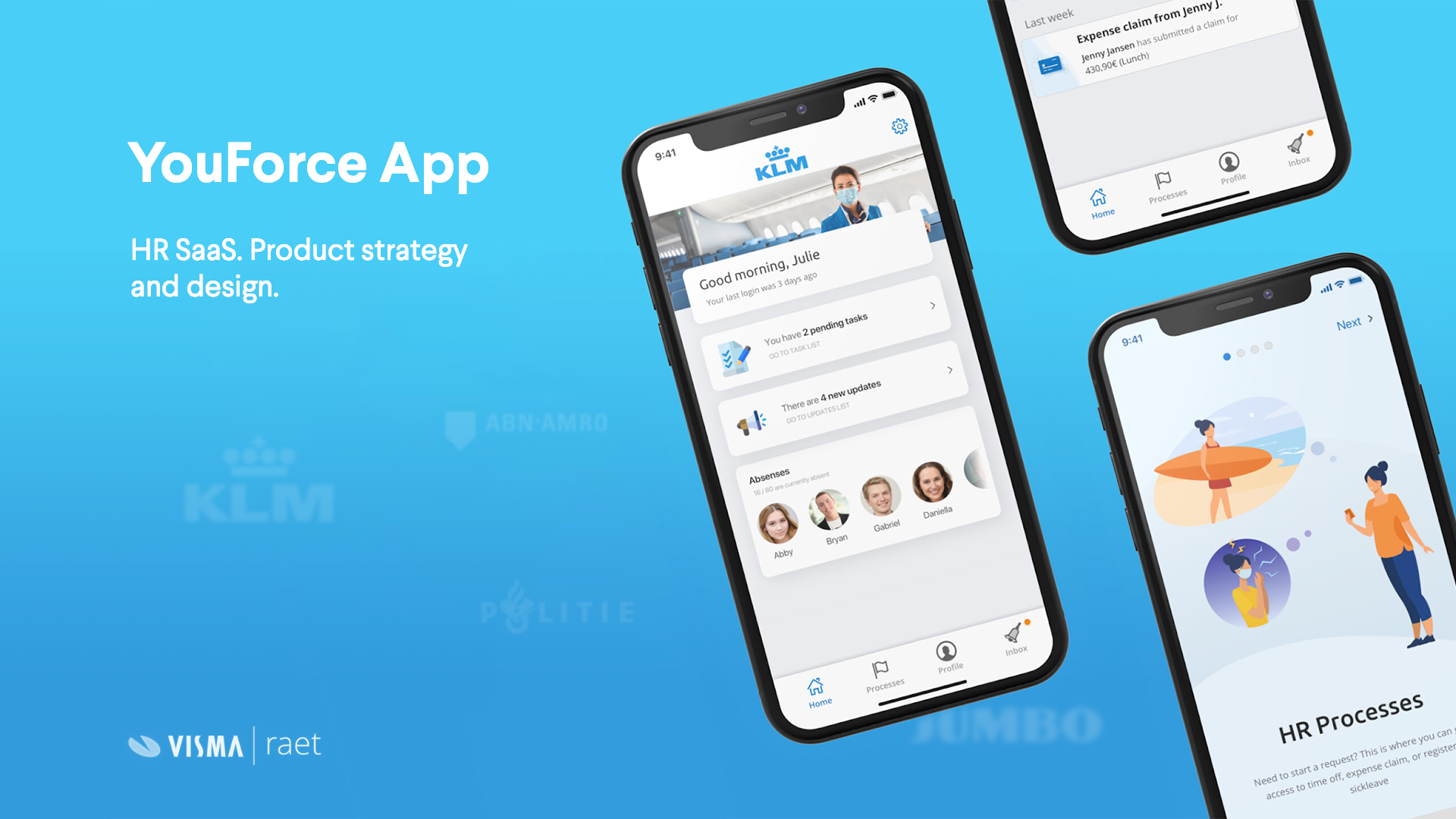
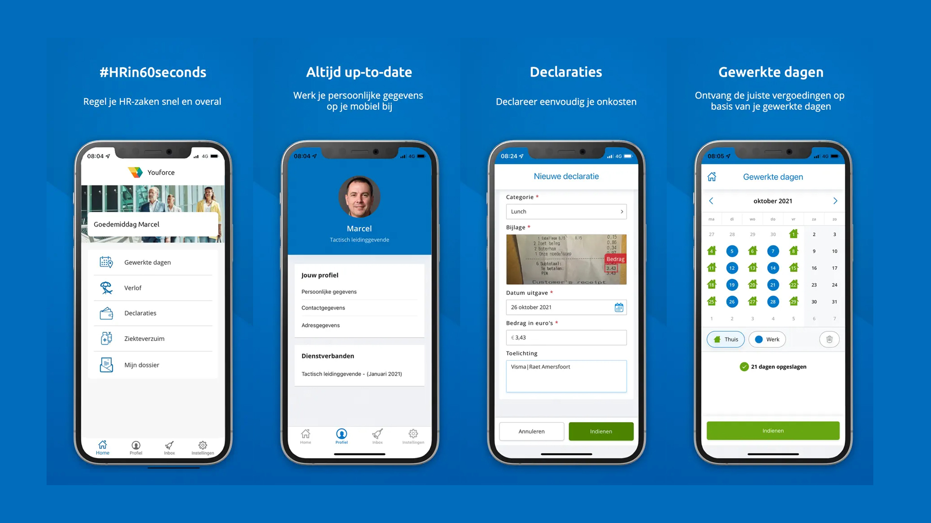
At Visma | Raet, we saw an opportunity to radically simplify how employees interact with HR: anytime, anywhere. The YouForce App was born out of this need: a mobile-first experience designed to handle essential HR tasks like submitting expenses, viewing payslips, managing leave, and accessing employment documents, all with just a few taps, and in under 60 seconds.
But this wasn’t just about convenience. The YouForce App is a strategic bridge between legacy systems and a modern, role-based HR platform. It reduces dependency on internal support teams, increases user satisfaction, and lays the foundation for a more proactive, intelligent HR ecosystem.
By putting employees first and meeting them where they are (on their phones) we not only improved efficiency, but redefined what stress-free HR looks like.
Strategy
002
Defining the Strategy
Before jumping into solutions, we needed clarity on the product strategy. Should we refactor existing solutions and prioritize faster delivery? Should we cater to new customer needs and change the company’s focus?
We faced a complex challenge. YouForce had to serve as a natural link between an old generation of desktop-heavy processes (37 in total) and a smaller, focused set of new mobile-first flows. Our users varied from employees needing to submit sick leave in seconds to managers tracking team performance or approving expenses on the go. To move forward with confidence, we had to validate assumptions quickly and collaboratively.
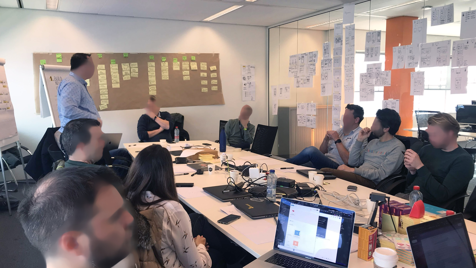
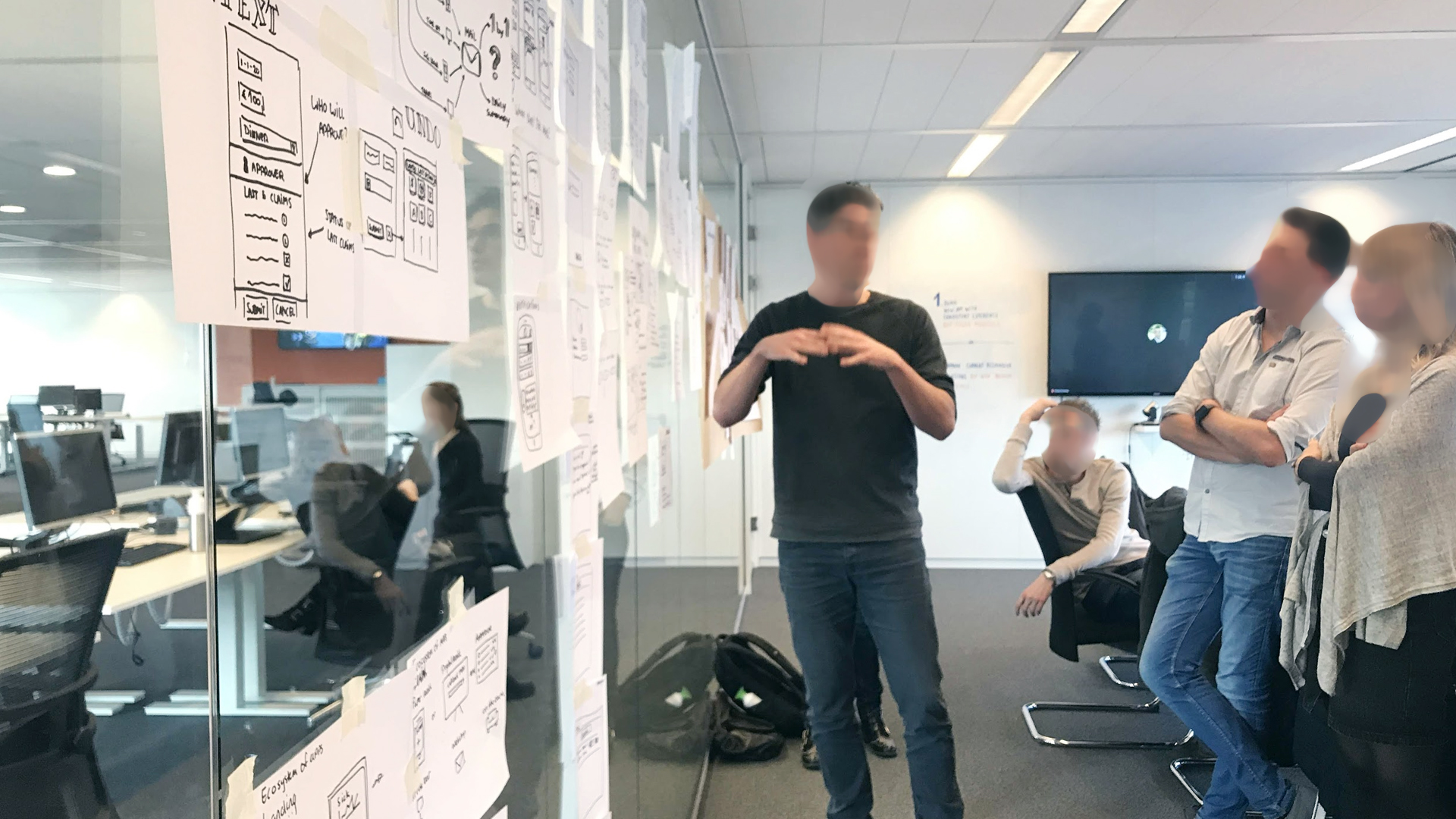
That’s why we chose to run a Design Sprint: In just five days, we brought together product owners, designers, sales reps, and real users from different sectors (public, private, healthcare). The sprint helped us frame the right problem, generate solutions, and test a working prototype all before writing a single line of code.
Design Sprint
003
The 4 Days
Design Sprint
Day 1
Understand & Define the Challenge
We kicked off the sprint by aligning the team around a shared understanding of the problem space. Through expert interviews, we unpacked the complexities of the legacy HR system and surfaced key challenges faced by both employees and managers.
We mapped out critical workflows—like submitting expenses, reporting sick leave, and requesting time off—and identified where current solutions broke down. Using “How Might We” (HMW) exercises, we reframed pain points into opportunity areas.
By the end of Day 1, we had:
A clearly defined challenge: bridge old and new HR workflows in a mobile-first way
Prioritized user roles and needs
Sprint questions to guide our focus for the rest of the week
Day 2
Explore & Sketch Solutions
We started the morning by reviewing competitive products and internal tools during a lightning demo session—gathering inspiration from best-in-class mobile experiences in HR and beyond. These examples sparked new ideas and set a benchmark for usability and simplicity.
Next, we transitioned into hands-on sketching. Each team member independently explored solutions to our core problems through rapid concept sketches. This approach encouraged diverse thinking and ensured every voice contributed to the solution space.
By the end of Day 2, we had:
Dozens of unique solution sketches
Early visual ideas for leave requests, expense claims, and sick leave reporting
A shared creative direction rooted in user needs and real-world inspiration
Day 3
Decide & Define the Flow
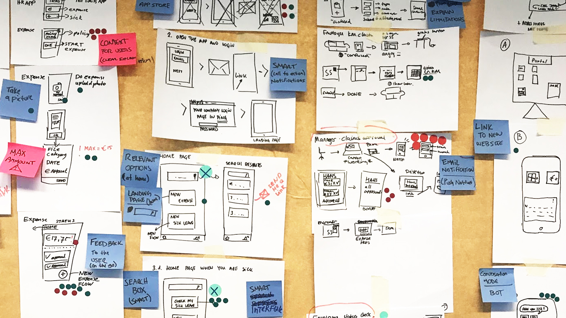
We began by reviewing all the sketches from Day 2 in a structured critique session. Through heatmap voting and discussion, we identified the most promising elements from each concept. These highlights formed the building blocks for our user journey.
Together, we mapped out three essential workflows to prototype:
• Submitting a sick leave report
• Requesting time off
• Claiming expenses with receipt capture
By the end of Day 3, we had:
• Voted on the best ideas from the sketching phase
• Designed a coherent user flow across all three tasks
• Defined the structure and logic for our prototype
This was the turning point of the sprint—where divergent ideas became a focused, testable solution.
Day 4
Prototype & Testing
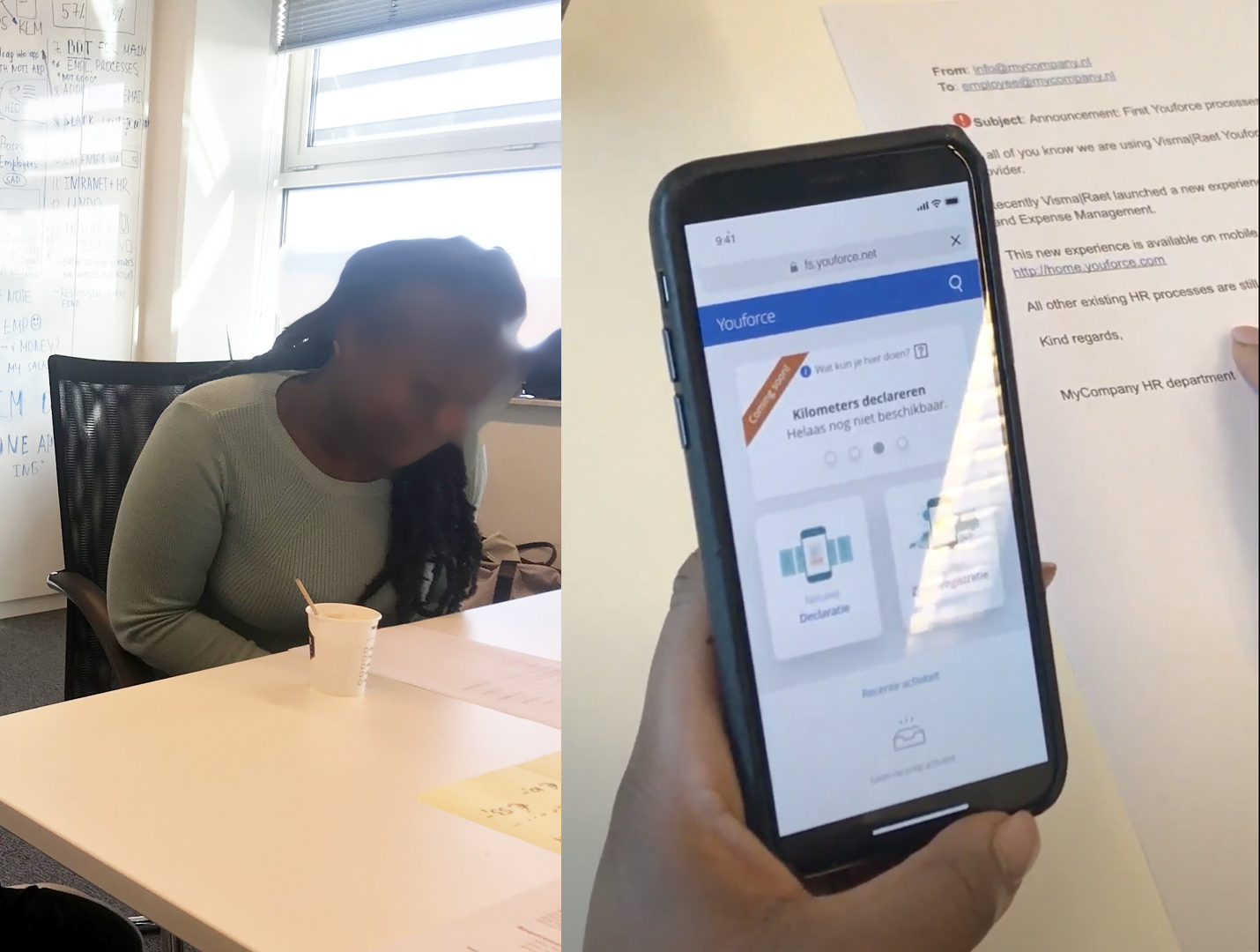
With a clear storyboard in place, Day 4 was all about bringing the vision to life.
Our focus shifted from ideation to execution as we built a realistic, interactive prototype using Figma. The goal wasn’t to perfect every detail, but to create a clickable version of the app that felt real enough for users to test and give honest feedback
We prototyped three key flows:
• Sick Leave Reporting, with simplified input and confirmation
• Time Off Request, including real-time feedback and approval status
• Expense Claim Submission, using photo upload and automatic field population
At the end of the day we proceeded to putting our prototype in front of real users—and learning from their reactions.
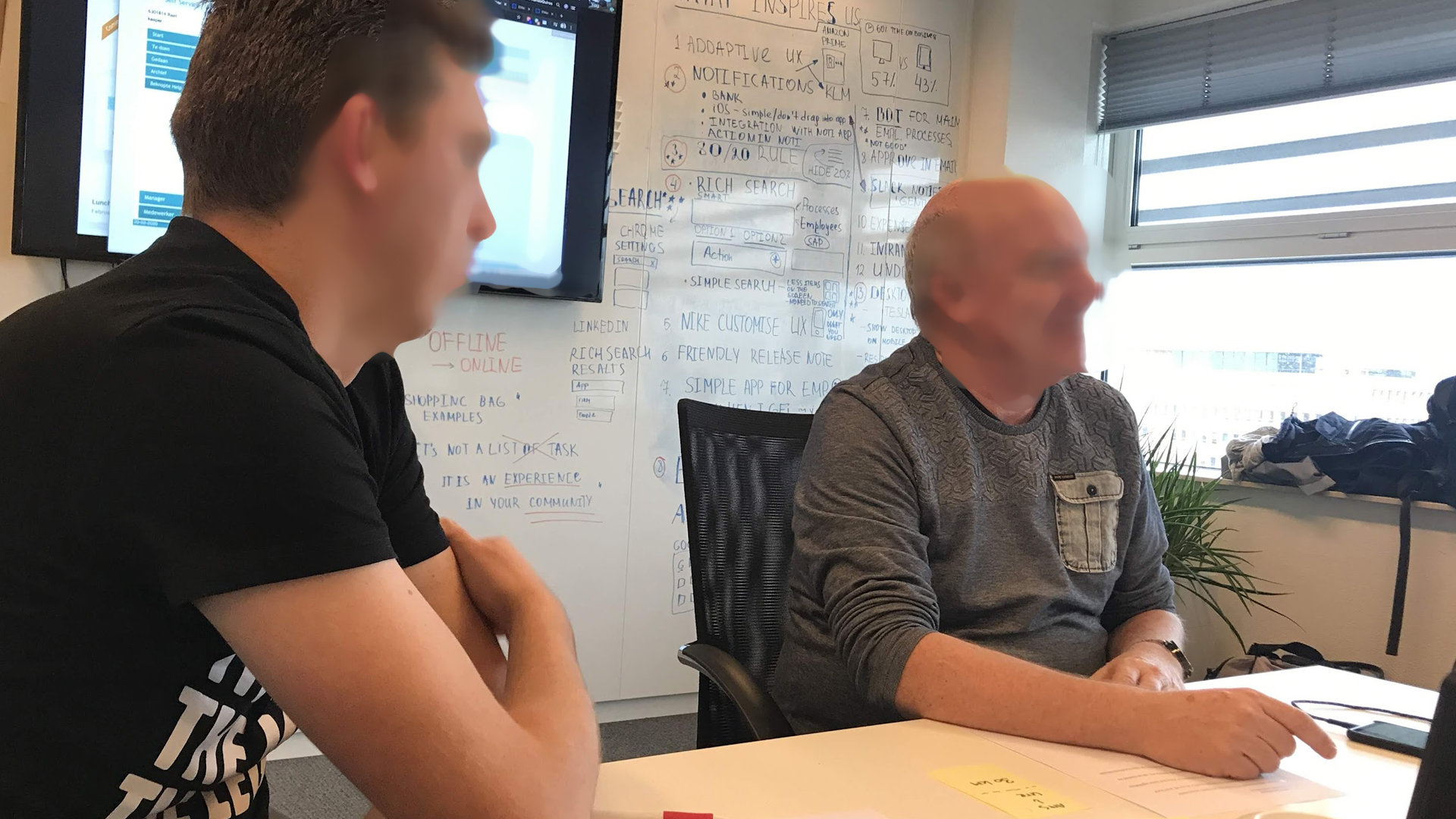
We conducted 1:1 usability tests with five participants across different roles and organizations, including HR specialists, managers, and employees from companies like RAI Amsterdam, BPO organizations, and Baker & McKenzie. Each session followed a structured script, walking users through core tasks like reporting sick leave, requesting time off, and submitting expenses.
The sprint ended with a team debrief, where we aligned on findings and prioritized actions for post-sprint iteration. We walked away with confidence, clarity, and a tested foundation to move forward.
Key learnings
From users
• Simplicity wins: Users consistently favored straightforward flows with minimal steps over feature-rich but complex interfaces.
• Trust matters: Features like biometric login and clear confirmation messages helped build confidence in using the app for personal HR tasks.
• Clarity over completeness: Small design details,like helpful labels, progress indicators, and feedback, made a big difference in usability.
From the Design Process
• Design Sprints are powerful: In just five days, we aligned cross-functional teams, generated validated solutions, and tested with real users.
• User feedback early is critical: Testing assumptions with users before committing to development saved time and helped us prioritize the right features.
• Sketching individually → better group ideas: Independent exploration before group discussion led to more diverse, high-quality concepts.
From the Product Strategy
Start small, solve big pain points: Focusing on three high-friction HR tasks (sick leave, expenses, and time off) helped drive early adoption.
• Cross-device thinking is essential: Designing for mobile-first while keeping the desktop ecosystem in mind led to more cohesive, scalable solutions.
• Co-creation with customers creates buy-in: Involving client organizations directly in the sprint fostered trust and helped ground our work in real-world needs.
In need of a seasoned facilitator to run a Design Sprint for your team?